
Deep Flare
#DEVLOG 3: HUD Evolution

Hello everyone!
Once again we're going with a delayed devlog about some stuff we've done some time ago. Alas, lately we've all been busy taking care of various things such as day jobs or university commitments. As we wrote in our first catch-up message, we knew that such moments were going to come and we planned our work accordingly. So, things are slowing down but definitely not stopping.
Enough with non-developing business! Let's talk about today's topic: the evolution of our game's HUD.
 |  |
Ye olde HUD vs the brand new one.
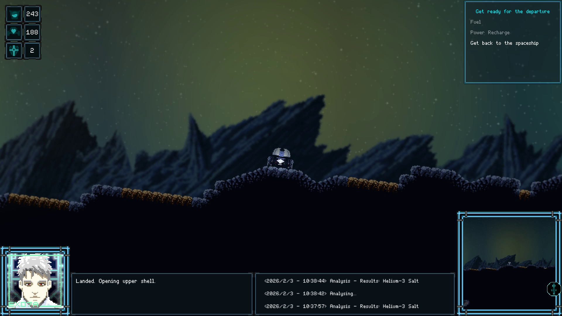
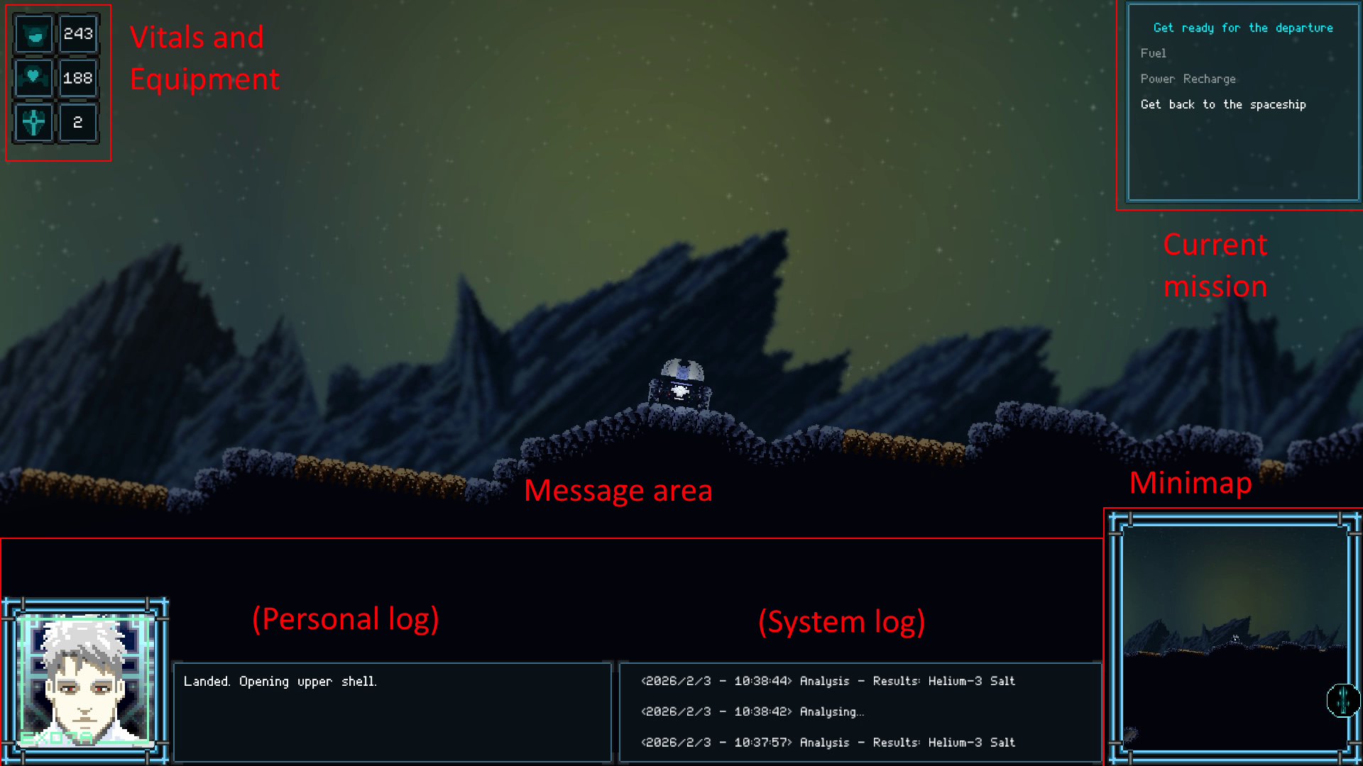
The HUD in Deep Flare: Explorer was designed around the idea of simulating a cockpit display, so everything the player would ever need to know was basically visible all the time. "Vitals" values - such as hull integrity and fuel amount - aside, that meant having to take some screenspace away to show the system messages log, William's personal log, the minimap, the focused documents section, and so on.
This approach received kinda mixed feedback. While some people didn't really care about it, some others criticized it as a "screen space theft" at the expense of the actual game view and all of its graphical features (parallax backgrounds, particle effects and so on). Alas we didn't have time for remaking it again while also working on our crowdfunding campaign and the other game features, so we stuck with it. But since we've decided to remake large portions of the game anyways, the HUD was actually one of the first things we got to work on.
But now, let's dive into the new system we came up with:
VITAL VALUES AND MINIMAP
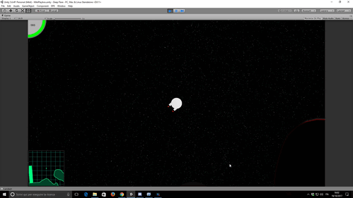
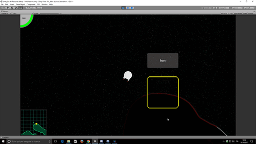
Hull integrity and fuel level were, and still are, the most important things the player has to keep his eye on. Hull integrity is represented as a curved bar that gets depleted when the exploration module is hurt. Fuel level, on the other hand, is now actually called Battery Charge - due to changes in the scientific design behind the game's tech - and is represented as a percentage.
The new minimap shows a wireframe-styled terrain and background now, instead of the old scaled game view, and we're planning to add several markers on it to help the player navigate the level.
MESSAGE ZONE
In the old HUD design, there were 2 main 'messaging' areas, both at the bottom of the screen. The left one was William's personal log, where he commented what he saw during his exploration. His face was also visible, in a sort-of Doom fashion, to let the player know about his emotional status. The right messaging area was the actual 'system log', showing messages about incoming transmissions, analysis results, and so on.
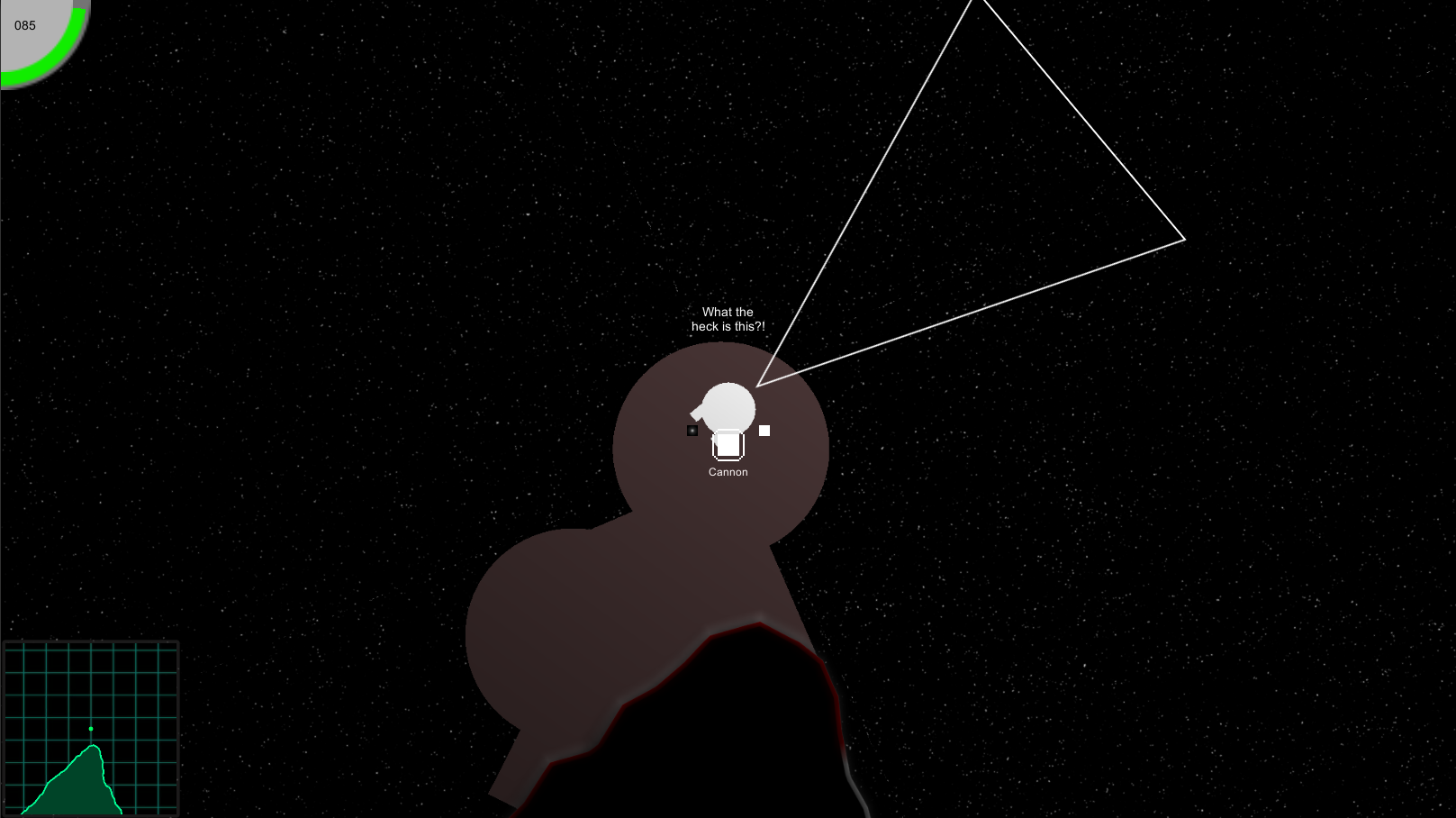
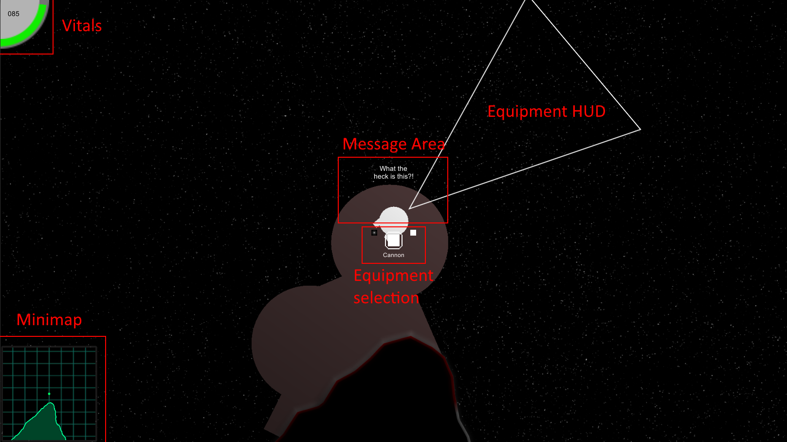
In our quest to free up screen space, we completely removed those two areas, which have been replaced with popup messages that will show up around the module. William's personal thoughts and comments are shown on top of the module, while the system log is now actually split into two kinds of popups: "standard" system messages (shown on the left) and system warnings (shown on the right). The former are those related to player activity's result, such as amounts of material drilled, names of objects taken, and so on. The latter are of course 'alarms' for the player, signaling whether there is little battery charge or hull integrity left.
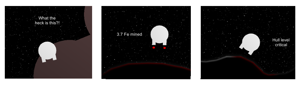
Thoughts - Messages - Warnings
EQUIPMENT SELECTION
Equipments are still selected by scrolling through them through pressing a button, but the relative graphical interface has been moved from the top-left corner of the screen to the center of the view. Its visibility is toggled by a change in equipment selected; after a few seconds, it fades away, freeing the screen space.
EQUIPMENT HUD
Once an equipment is selected, its peculiar HUD is activated. Every single utility has its one, allowing the player to get clear and concise information about its capability. And, since some utilities have different control systems based on which input system is selected (mouse + keyboard or gamepad), the HUD can display different icons based on it.
Here are a few examples:

Cannon HUD, displaying allowed shooting area and aiming line

Magnetic Snare HUD, displaying allowed area
Flyby analyzer. Different kind of markers are added to the game view and minimap upon analysis
The Drill HUD is displayed on landing. It shows how much material is drilled and the amount of space left
Leave a comment
Log in with itch.io to leave a comment.